This is a Qlikview solution I posted on Qlikview’s forum in response to a user request for displaying employee work schedules in a Gantt chart style presentation.
https://community.qlik.com/thread/51554
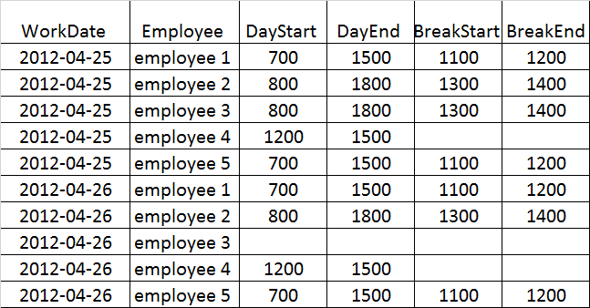
The solution included setting up the data for the Qlikview chart in a table format as shown below.
Original:
Load WorkDate,
    Employee
    From [C:\BI\schedule demo - data.xls]
    (biff, embedded labels);

Set IntervalStart = 700;
Set IntervalEnd = 800;

//Loop through each employee record to get hour intervals
For i = 1 to 11
Original2:
    Load $(i) as rowNum,
        WorkDate,
        Employee,
        DayStart,
        DayEnd,
        $(IntervalStart) & '-' & $(IntervalEnd) as Interval,
          //Check if hour interval is within emp start<> end and give it "1" (so it can be conditionally formatted later")
          //I didn't do the extra check to see if the interval is break interval but you could just add add'l If to IntervalValue
        If($(IntervalStart) >= DayStart and $(IntervalEnd) <= DayEnd, 1, 0) as IntervalValue
        From [C:\BI\schedule demo - data.xls]
        (biff, embedded labels);
    Let IntervalStart  = IntervalStart + 100;
    Let IntervalEnd = IntervalEnd + 100;
Next i
The data for this table could come from any data source eg Excel, csv file, database query results, etc. In this example it is an Excel .xls file.

Use the Qlikview pivot table using WorkDate, Employee & Interval as dimensions and IntervalValue as Expression. Then conditionally format for fill with Expression so if 1 then it green. Note that the “0” values are still showing in my example but you could do conditional text format on 0 to turn them white eg to hide the 0’s.
The pivot table can be changed to show daily employee coverage as well.
Many additional things could be added to this solution. For example if you are tracking employee schedules by another category such as event or department, these can be added to the data and then used to slice and dice by these other dimensions in the pivot tables.