OpenAI ChatGPT 4 Advanced Data Analysis is pretty amazing! I put it to the test on some data I analysed recently.
The data was a multi-year daily set of a river’s level and discharge measurements at a specific location on the river. The river level is measured in meters and the discharge in cubic meters per second. The data comes from a Canadian government website.
I had originally created Power BI analysis and reporting using this data. I was curious to see if ChatGPT 4 Advanced Data Analysis could match the analysis and visualizations done in Power BI and how long it would take. TLDR ChatGPT 4 Advanced Data Analysis could do it much faster with relatively good analysis and visualizations.
Original Power BI Report
The data used in ChatGPT 4 Advanced Data Analysis was an extracted from the Power BI report dataset as a single csv file with one row per measurement per day per parameter and had the following columns:
-
- Date – formatted as YYYY/MM/DD
- Parameter – either level or discharge
- Value – decimal number
In a new ChatGPT chat, I selected ChatGPT 4 and ChatGPT 4 Advanced Data Analysis.
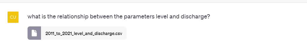
This provides a prompt which has a file upload feature. I could then upload the csv file and make the first prompt below asking “what is the relationship between the parameters level and discharge?”
The response gave some basic inputs about the shape of the data in the csv file along with an impressive insight that the data had to be reshaped in order to analyse the relationship between level and discharge so it could create a scatter plot of level vs discharge and calculate a correlation coefficient.
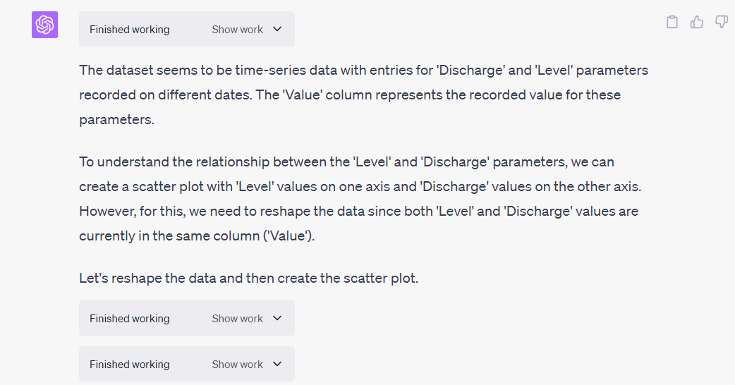
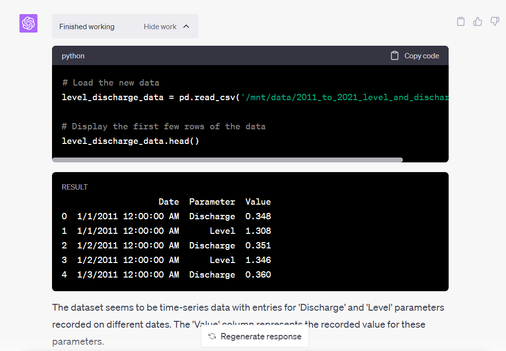
In the responses you can click the “Show work” button to reveal the Python code and results generated. In this next screenshot you can see it load the csv and show its contents.
The resulting scatter plot is something I created myself manually in my previous analysis. In the world of water flow analysis this visualization can be called a “rating curve”. Each location in a river can be characterized by its rating curve. Then one only needs to collect river water level values and then calculate the discharge based on the rating curve.
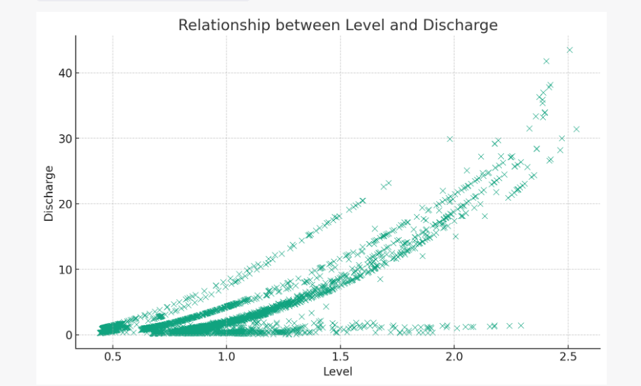
The response also included some analysis of the results along with the calculated correlation coefficient to support the identification of a positive correlation between level and discharge.
I then provided information this was water flow measurements and asked it to visualize each parameter by year.
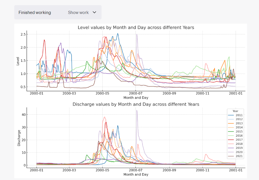
The response reshaped the data again so it could create a stacked line chart by year for each of level and discharge over the months and days of the year.

This visualization allows a visual comparison of annual flows by month and day. This can help identify anomalies visually. The overall annual trend is more water flow in the spring in this river’s case primarily due to snow melt.
In order to better visualize level and discharge changes over time I asked it to plot both values by day over all years.
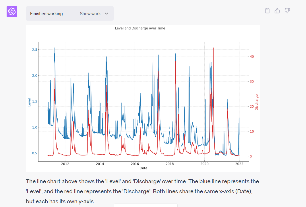
The analysis in the response isn’t very novel but it does include an obligatory caution about comparing parameters in a chart with two y-axis. However, in this case, level and discharge are related.
It may be interesting to note that while discharge is relatively constant over time, the level is decreasing. This indicates that the river channel is becoming wider and more shallow at this location.
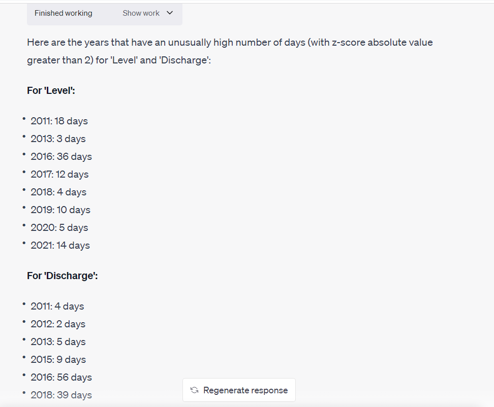
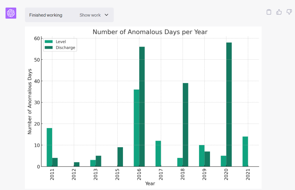
I also asked it to identify anomalous time periods for each parameter. It gave a description of what it could do to respond to this and proceeded to do the analysis. In this case it identified it could calculate “z-scores” and then identify statistical outliers based on daily z-score values.

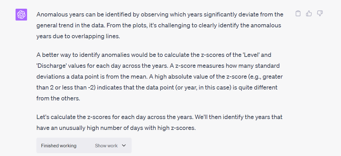
It then listed years that had anomalies along with count of days with high absolute z-score values.
I asked it visualize these and it produced a clustered bar chart of level and discharge anomalous counts by year.
![]()
I paused during my analysis and came back a few hours later to continue. In the meantime, the chat had timed out which dropped the Python cache of its previous work including the uploaded csv file so it has to apologize for not being about to continue until it can rerun code.
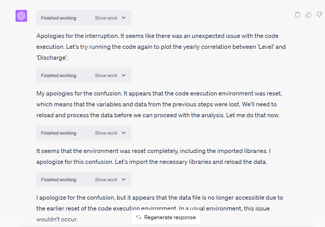
It also it needed me to re-upload the csv file so it could then rerun all of its work from the beginning.
As an example of reworking the analysis, I then modified the level and discharge value line chart so it was split by year using sub-plots and it did a pretty good job of that.
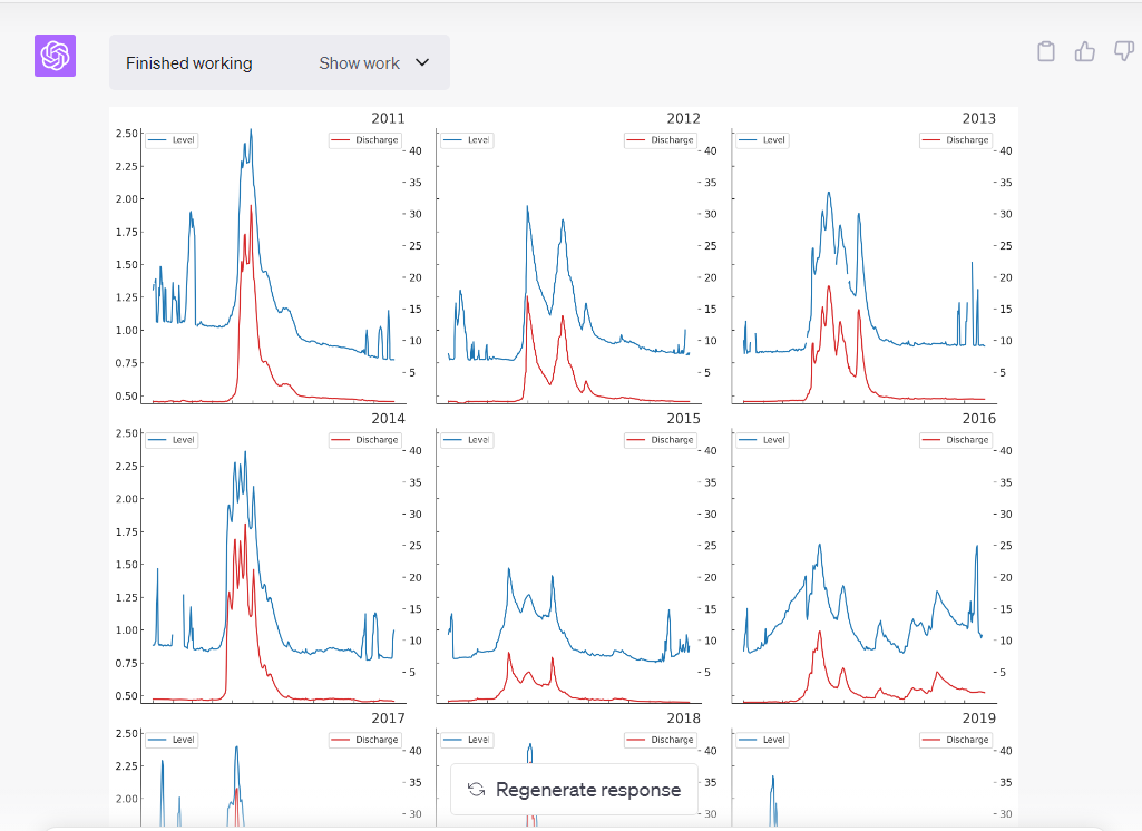
I was able to successfully continue modifying the visualization. Some of these are described below as way of examples.
ChatGPT 4 Advanced Data Analysis made this analysis fast and easy. I makes it easy to avoid having to do a lot of manual exploratory analysis on the data. While there are a lot of tools on the market including the Q&A feature in Power BI to help quickly learn about a dataset, it was very fast and useful using ChatGPT 4 Advanced Data Analysis.