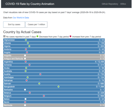
This visualization shows COVID-19 new cases as a “race” of dots moving from left to right.
The dot’s “speed” or how long it takes to move from left to right is based on the number of cases per day.
If a country has one case per day, it will take an entire day for the dot to move from left to right. Some countries have many 1000’s of new cases daily and the dot moves from left to right in minutes or seconds.
There are three visualizations for following geographical regions. Click “viz” to view the visualization and “github code” to view the code for the visualization:
-
- Countries of World: viz / github code
- United States: viz / github code
- Canada Health Regions: viz / github code
The screenshot below shows countries of world. Some countries have not had any new cases over past 7 days so show as gray. Those that have had new cases over past 7 days are shown as white circle (no change from prev 7 days), red (increase from prev 7 days) or green (decrease from prev 7 days).
The visualization is sorted by country by default but can change sorting by average new cases. In addition, you can toggle between showing new cases as actual count or new cases per million (population).
The visualization uses D3.js SVG to create a canvas for each location, the location name text & counts, and circle shape, and transitions, and to retrieve csv file and process data, including filtering to most recent 7 days, group by location to get case count means.
The most important aspect for this visualization was how to use D3.js to animate the movement of the white circle across the canvas, and how to repeat the movement in an ‘endless’ loop.
The code block below hightlights use of a function that uses D3.js .on(“end”, repeat); to loop through repeat function ‘endlessly’ so that shape is moved across canvas, and then back to original position, to move across canvas again and again. See bl.ocks.org ‘Looping a transition in v5’ example.
The duration() value is the proxy for rate in this visualization and is calculated in another function separately for each location SVG. I also added a counter that would increment an SVG text value to show each loop’s count on canvas.
// repeat transition endless loop
function repeat() {
    svgShape
    .attr("cx", 150)
    .transition()
    .duration(cycleDuration)
    .ease(d3.easeLinear)
    .attr("cx", 600)
    .transition()
    .duration(1)
    .attr("cx", 150)
    .on("end", repeat);

    svgTextMetric
    .text(counter + ' / ' + metric);
    counter++;
  };
This visualization was inspired by Jan Willem Tulp’s COVID-19 spreading rates and Dr James O’Donoghue’s relative rotation periods of planets, and uses same data as Tulp’s spreading rates.
