During the 2020 COVID-19 pandemic in Canada I wanted to get better understanding of the geographical distribution of COVID-19 related activity changes across Canada.
Google has helpfully provided freely available global “Community Mobility Reporting” which shows Google location history change compared to baseline by country, and country sub-regions. These provide changes in activity by location categories: Workplace, Retail & Recreation, Transit Stations, Grocery & Pharmacy and Parks locations, and Residential locations. For Canada it is available by province. As of April 19, data contained daily values from Feb 15 to Apr 11.
The Community Mobility Reporting data is available as a single csv file for all countries at Google Community Mobility Report site. In addition, Google provides feature to filter for specific country or country sub regions eg state or provinces, etc and download resulting PDF format.
As the COVID-19 lockdowns occurred across Canada you would expect that people were less likely to be in public spaces and more likely to be at home. The Community Mobility Reporting location history allows us to get some insight into whether or not this happened, and if it did, to what degree and how this changed over time.
I used the Community Mobility Report data to create a D3.js heat map visualization which is described in more detail below and in this Github repository.
I also created an Excel version of this heat map visualization using Pivot Table & Chart plus conditional formatting. This Excel file, described in more detail below, is available in the Github repository.
More detail and screenshots of visualizations is provided below:
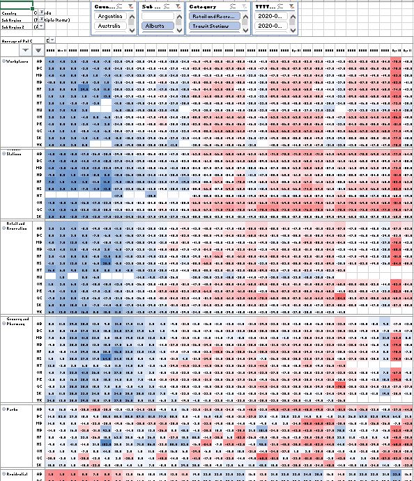
Heatmaps
Heatmaps are grids where columns represent date and rows province/territory. Each heatmap is a grid representing a single mobility report category. The grid cell colors represent value of percent change which could be positive or negative. Changes can be observed as lockdowns occurred where locations in public areas decreased relative to baseline. Inversely, residential location increased relative to baseline as people sheltered in place at their homes.
1) Heatmap created using Excel / Power Query: For this heatmap visualization the global csv data was transformed using Excel Power Query. The Excel file has two Pivot Table and Chart combos. The Excel files and Power Query M Code are in the repository. Excel files are available in Github repository.
2) Heatmap created using D3.js: For this heatmap visualization the global csv data was transformed using Excel Power Query. The heatmap visualization was created using slightly modified code from ONSvisual.

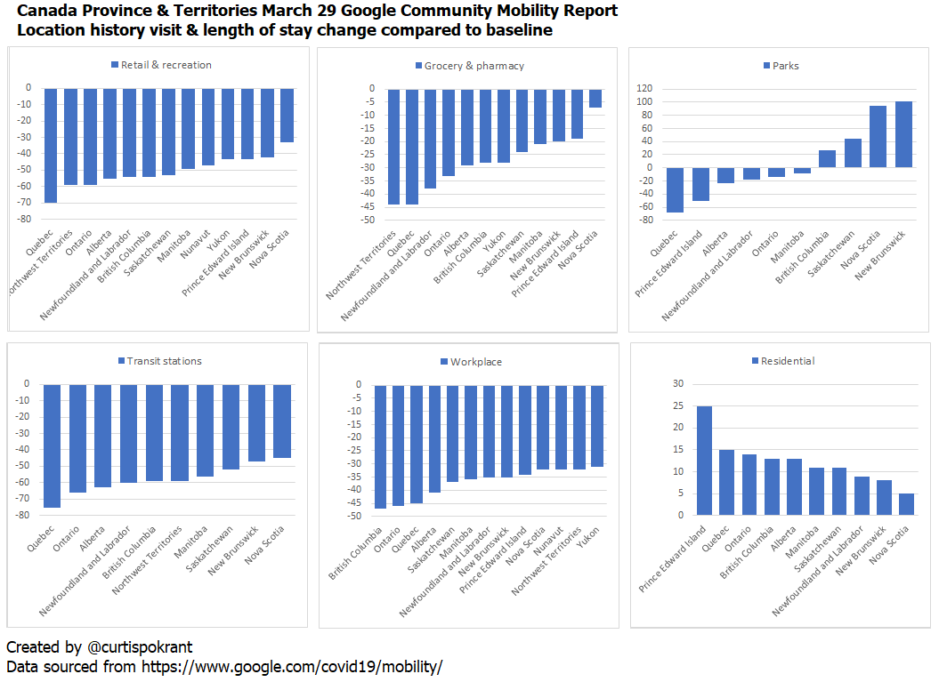
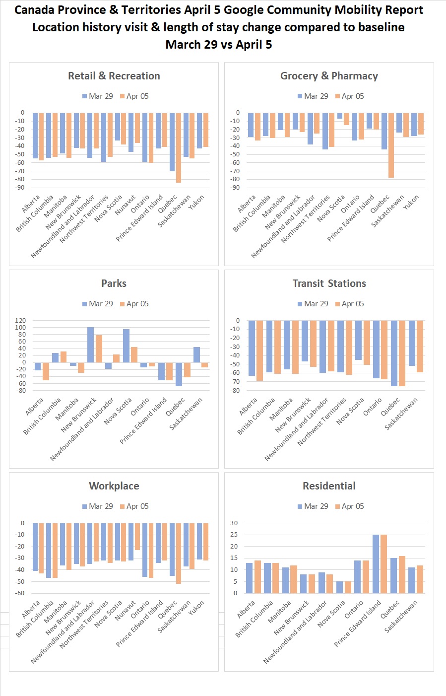
Bar charts
These were created using Excel to visualize percent change by Province/Territory and location category using Excel / Power Query. These allow comparison between provinces by date and category. This Excel / Power Query file can be used for analytical purposes to slice and dice global data by date, country, sub region 1 & 2 and category. Excel files are available in Github repository.