A while back LinkedIn sneakily vacuumed up all of my contacts from my phone via the Android Cardmunch app. Turns out Cardmunch is owned by LinkedIn. There must be fine print somewhere that indicates they do this but I sure didn’t see it.
Many of my contacts that were imported were out of date and in most cases not someone I wanted to be LinkedIn with. Some had actually passed away.
It took a mini-campaign of customer service interaction to get LinkedIn to delete the imported contacts.
Anyways I discovered this had happened when suddenly large numbers of my contacts started showing up in my LinkedIn’s “People You May Know” page.
The PYMK page is a LinkedIn feature that identifies 1,000 people LinkedIn thinks you may know. LinkedIn identifies people you may know by matching contacts they vacuum up from everyone’s address books. They probably also do matching of people on company name, profession, city, LinkedIn groups, etc too.
When LinkedIn finally agreed to delete the contacts I monitored the PYMK page to make sure they were doing it and that it was permanent.
My monitoring was a mix of manual work and automation. I regularly manually downloaded and saved the PYMK webpage and extracted the names on the page to see if my stolen contacts were still on the page. The contacts were removed very quickly (thank you LinkedIn : )) but I continued downloading the PYMK page because I was curious to see how the names would change over time. I ended up downloading the page 29 times over a 3 month period.
I used Python and BeautifulSoup to process the downloaded PYMK html pages and scrape them for the data I wanted.
I used Excel add-in Power Query to shape the data and Excel Pivot tables and charts for the visualizations.
After I downloaded a new page I would run the code on a folder containing the PYMK web page files to produce a data file for analysis. I just wanted to see that my 2,000 imported contacts were deleted. Finally after a few weeks they were gone.
Here are some of the results.
Over the 3 month period about 6,300 unique people were on my PYMK page at least once.
The data I have is incomplete because it wasn’t a daily sample of the PYMK page. I downloaded the pages only 29 times over a 3 month period of time.
Even so it does give some relative information about people’s appearances on my PYMK page.
People’s appearances were not a contiguous series of days. There were gaps in appearances. LinkedIn appears to swap people in and out over a duration of days.
A Gantt chart style visualization made the pattern of people’s appearances obvious. The screenshot below shows an overview a huge 6,300 row Gantt chart that has one unique person per row. The columns are the 29 downloads. The records are sorted descending by 1st date of appearance eg so most recent are on top.
The pink cells indicate that a person appeared on that downloaded PYMK page. Blue cells cells are where they did not appear on the page. At a quick glance you can easily see the regular patterns of appearances on the PYMK web page.
Over time eg going from bottom of chart to top (it is sorted by date people are added to page eg most recently added on top) you can see people are always being introduced to the PYMK page. Some people added in past continue to appear on the page and some appear a few times never to reappear on page.
The varying patterns indicate that the methodology LinkedIn uses to select people to show on my PYMK page changed over time.
The two big columns of pink at the very bottom there are the 2,000 people that were imported from my contact book. Most appeared for only the first few downloads and then LinkedIn deleted them so they don’t ever appear again.
Gantt chart style presentation of all 6,300 people (one unique person per row). Records are sorted descending by 1st date of appearance eg so most recent are on top.
Click on image to open in new tab to view full size.
![]()
Using the 1st and last day people appeared on the 29 downloads I could calculate a ‘duration’ for each person. These are durations are shown in a frequency distribution chart below.
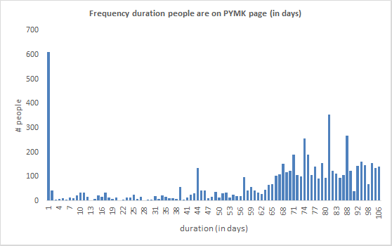
Many people appeared over most of the 3 months. About 50% remained on the page for more than 2 months. This would have changed had the sampling continued eg more people may have remained on the page as long too.
However, the relative distribution does indicate that there is a split between people that stay on page and those that are just passing through.
The bulk of the people who appear only once on the PYMK page once are the 2,000 contacts that were imported and then deleted. Some of these appeared in the first PYMK page download and never again, some appeared in one or two subsequent downloads until they were all finally deleted.
What is interesting is that LinkedIn was not able to match these contacts to me using their other methods. That hints that the basic mechanism behind the PYMK matching is simple contact name matching between LinkedIn accounts.
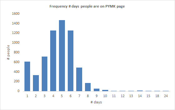
Of the 29 downloaded PYMK pages most people were on the page less than 9 times as shown in the frequency distribution below. Daily sampling would likely see these counts increase though I expect the relative distribution would be similar.
I created a ‘presence’ metric that is the relative # days appearances people have over their entire # days from their 1st appearance to last appearance. This is shown in the frequency distribution below. The big spike at 100% are the imported contacts which showed up in only one download (and then were deleted from LinkedIn forever).
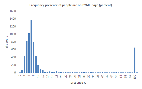
Daily sampling would have seen the distribution shift to the right towards 100%. I guess that the peak of the distribution would shift up to around 30% eg most people appear about 30% of the time from when they 1st appear to their last appearance.
The Python code used to scrape the downnloaded PYMK web pages was the following:
- Go to LinkedIn PYMK page, scroll down until all 1000 contacts are shown. The page has ‘infinite scrolling’ that pages through entire 1000 contacts incrementally. I couldn’t find easy way to get Python to do this for me automatically which would have been nice.
- Save resulting web page as html file on my computer.
- Run Python script with BeautifulSoup (below) to get list of names.
- Compare list of names day to day to see the changes made.
Python code to get names from a single html file:
from bs4 import BeautifulSoup
soup = BeautifulSoup (open("pymk.htm"))
    for card in soup.findAll('a', 'title'):
        for title in card.find_all('span', 'a11y-headline'):
            print str(card['title'].encode("utf-8")) + ' | ' + str(title.string.encode("utf-8"))
Python code to get names from a folder of html files:
import os
from bs4 import BeautifulSoup
    path = str('C:/PYMK Page Downloads/')
    for file in os.listdir(path):
        file_path = os.path.join(path, file)
        soup = BeautifulSoup(open(file_path))
        for card in soup.findAll('div', 'entityblock profile'):
            name2 = card.find("a", {"class":"title"})['title']
            name = name2.encode("utf-8")
            title2 = card.find("span", {"class":"a11y-headline"})
            title = title2.text.encode("utf-8")
            connections2 = card.find("span", {"class":"glyph-text"})
            if connections2 is None:
                connections = 0
            else:
                connections = connections2.text.encode("utf-8")
            print str(file) + ' | ' + str(name) + ' | ' + str(title) + ' | ' + str(connections)
Analysis of results