This post is focuses on a project of the analysis of scaped comments from CBC News website articles. (BTW, there are lots of “CBC’s” in the world. The one I am referring to is the Canadian Broadcasting Corporation.) Another post details web scraping method used to get the articles and their comments.
As a Canadian often travelling and working abroad I use the CBC News site as a way to stay current on Canadian news. Not all of the articles have comments enabled.
Frankly, the quality of the comments is quite low. While the comments are actively moderated, because it is very easy to create an account, there are probably a lot of bots and throwaway accounts. The comments can represent the worst of social media often very snarky, aggressive and politically partisan.
However, as a data worker I was curious to analyze them. I wanted to learn more about who made how many comments, frequently used words and phrases, and interactions between people commenting (comments and their replies) on the site.
I used a variety of techniques to scrape the articles and their comments and save the data as csv files which I could then analyse. Comments include a timestamp when it was posted, comment text, and comment user name, and if it is a reply, then name of the comment user being replied to.
After an article is posted comments are made dynamically and after a while commenting is disabled. So each article can have varying numbers of comments. Many articles never have commenting enabled. Some articles can have more than 10,000 comments by 1,000’s of people.
On of the analyses I did on the scraped data was to create “network charts” for each article’s comments using the Python NetworkX module. Network charts are helpful to show interactions between nodes. In this case the nodes are the people making comments and replies.
A presentation of the resulting network charts for each article I analysed can be seen at this Github repository web page https://sitrucp.github.io/cbc_comments/image_grid.html.
The code used create the NetworkX charts is shown below and is also available in this Github repository.
import networkx as nx
import matplotlib.pyplot as plt
import math

# Drop comments without any replies
df.dropna(subset=['replied_to_user'], how='all', inplace=True)

# Build NetworkX graph
G = nx.Graph()

# Select data to use in graph from dataframe with full data
G = nx.from_pandas_edgelist(df, 'comment_user', 'replied_to_user', 'minutes')

# Create node size variable
d = nx.degree(G)

# create edges, and weights list for edge colors
# weights are minutes from first comment
edges, weights = zip(*nx.get_edge_attributes(G,'minutes').items())

# create variable to increase graph figure size based on number of nodes to make more readable
factor = math.sqrt(len(G.nodes()) * 0.01)

# Create plot
plt_width = 25 * factor
plt_height = 25 * factor
fig, ax = plt.subplots(figsize=(plt_width, plt_height))
fig.set_facecolor('black')
ax.set_facecolor('black')

# create layout kamada_kawai_layout seemed best!
#pos = nx.spring_layout(G, k=.10, iterations=20)
#pos = nx.spring_layout(G)
pos = nx.kamada_kawai_layout(G)
#pos = nx.fruchterman_reingold_layout(G)

# draw edges
nx.draw_networkx_edges(
    G,
    pos,
    arrows=True,
    arrowsize=20,
    edgelist=edges,
    edge_color=weights,
    width=1.0,
    edge_cmap=plt.cm.spring,
    node_size=[(d[node]+1) * 200 for node in G.nodes()], # tells edge to go join node on border
)

# draw nodes
nx.draw_networkx_nodes(
    G,
    pos,
    node_color='red',
    alpha = 0.7,
    edgecolors='white', #color of node border
    node_size=[(d[node]+1) * 200 for node in G.nodes()],
)

# draw labels
nx.draw_networkx_labels(
    G,
    pos,
    labels=None,
    font_size=10,
    font_color='white',
    font_family='sans-serif',
    font_weight='normal',
    alpha=None,
    bbox=None,
    horizontalalignment='center',
    verticalalignment='center',
    ax=None,
    clip_on=False
)

# create variables to use in chart title
min_comment_time = df['comment_time'].min()[:-3]
max_comment_time = df['comment_time'].max()[:-3]
comment_count = len(df)

# create chart title text
title_text = file_url + '\n' + str(comment_count) + ' comments & replies '+ 'from: ' + min_comment_time + ' to: ' + max_comment_time

# add chart title
plt.title(title_text, fontsize=26 * factor, color='white')

#  save the image in the img folder:
plt.savefig(file_path_image + 'network_' + file_name + '.png', format="PNG")
The network charts have the following features.
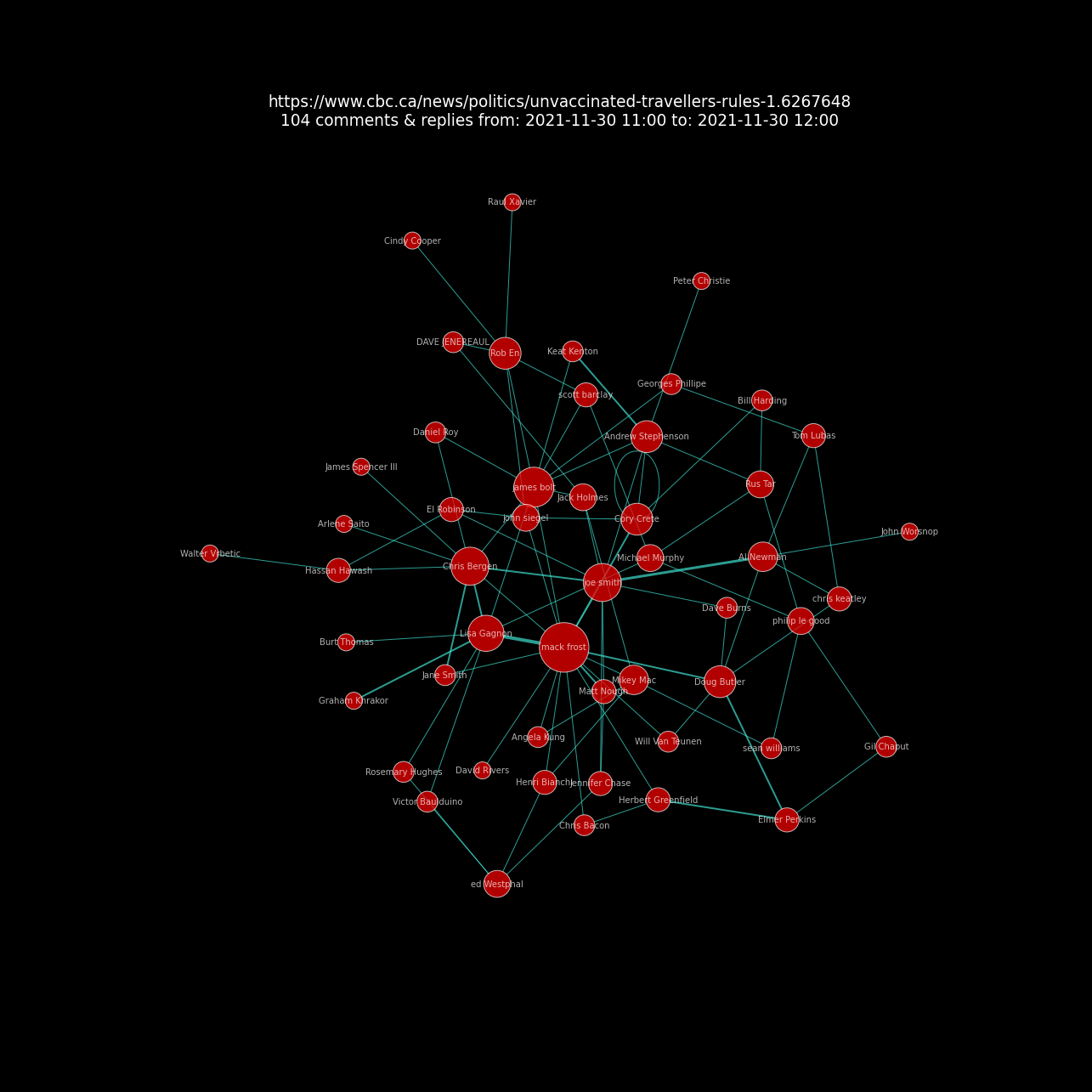
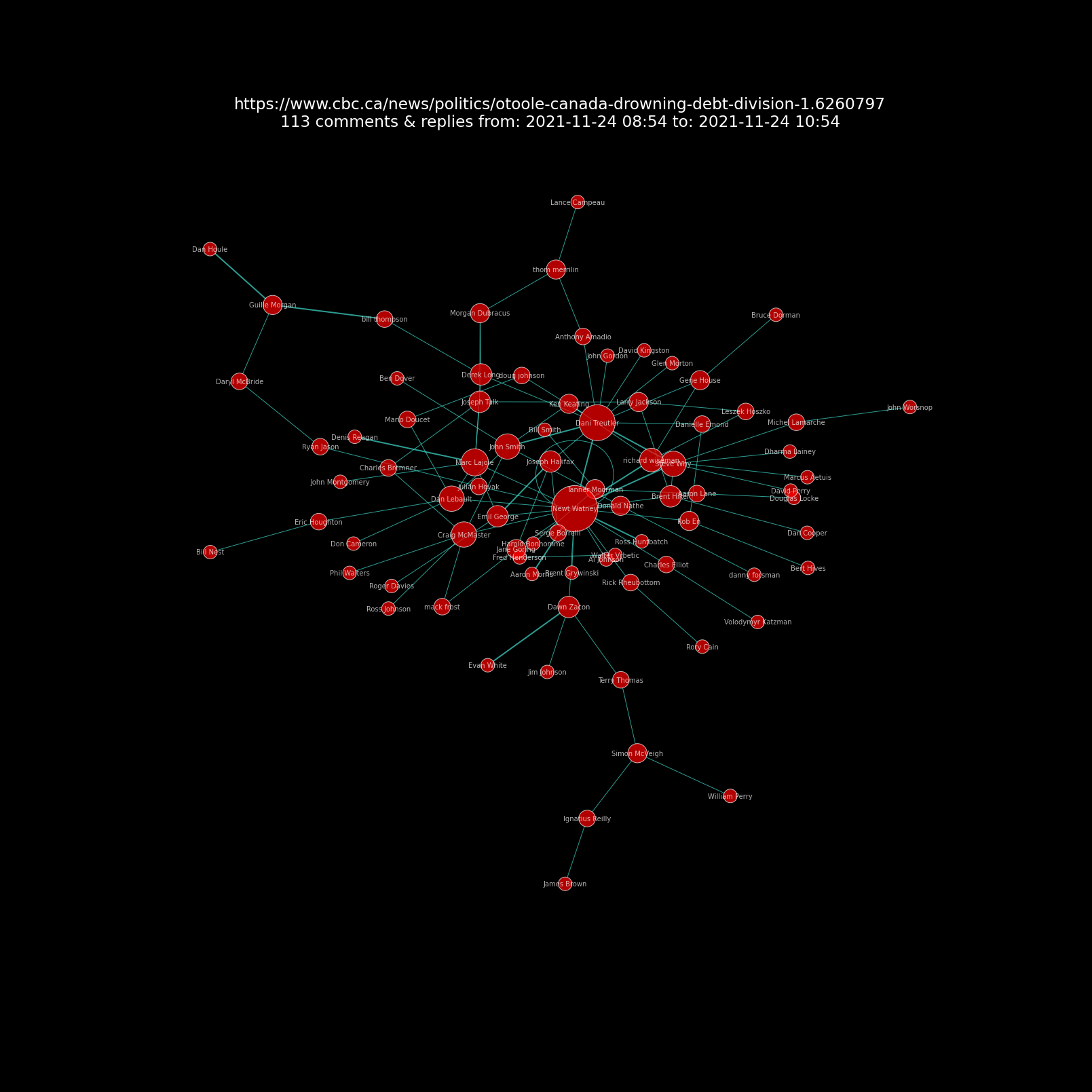
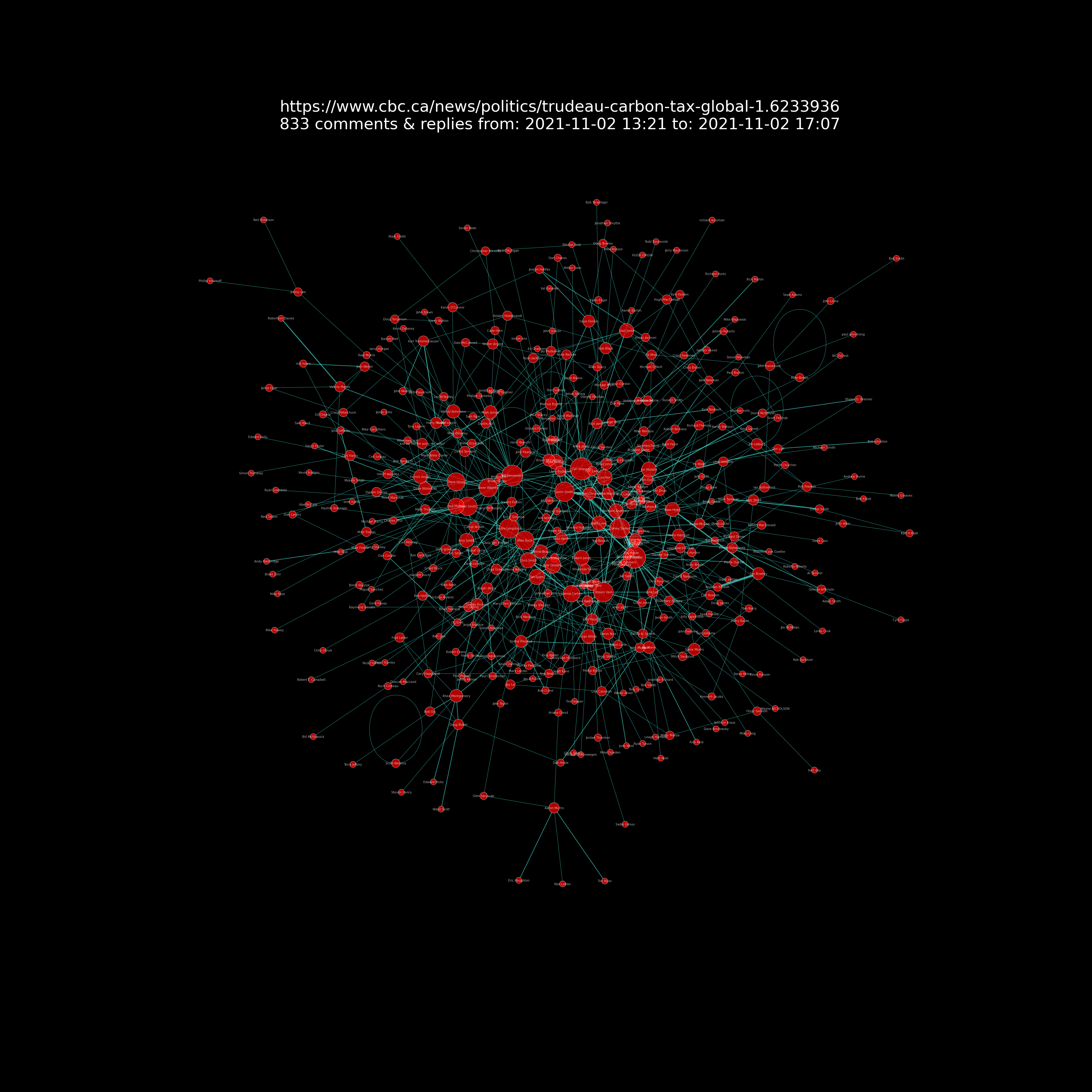
Nodes: The red circles (“nodes”) are users. The red circle size corresponds to user comment counts. If you zoom in on the chart you can also see the commenter’s name in white lettering.
Edges: The lines (“edges”) connecting the red circles represent interactions between users as replies to comments. The line’s arrows indicate direction of interaction eg who replied.
It’s quite interesting to note that article comments and replies have their own unique pattern of interactions but also that overall there are general patterns of interactions.
The first network chart below only contains 104 comments and replies on the article Unvaccinated travellers over the age of 12 barred from planes and trains as of today. This provides a very clear simple view of the nodes and lines.
(Note comments data fro this visualization were obtained just after the article was posted when it had about 100 comments and replies. It eventually had 2000+ comments.)
The second network chart below shows an article On COVID restrictions, our governments keep firing up the gaslights and shifting the goalposts with 6,052 comments and repliesThese comments and replies were made by 1,140 people.
This makes for a very dense visualization and a big image size compared to the first network chart above. You can see that there are some people commenting much more than others represented by the larger red circles. Not surprising, these people garner more interactions eg replies from others as represented by the blue lines.
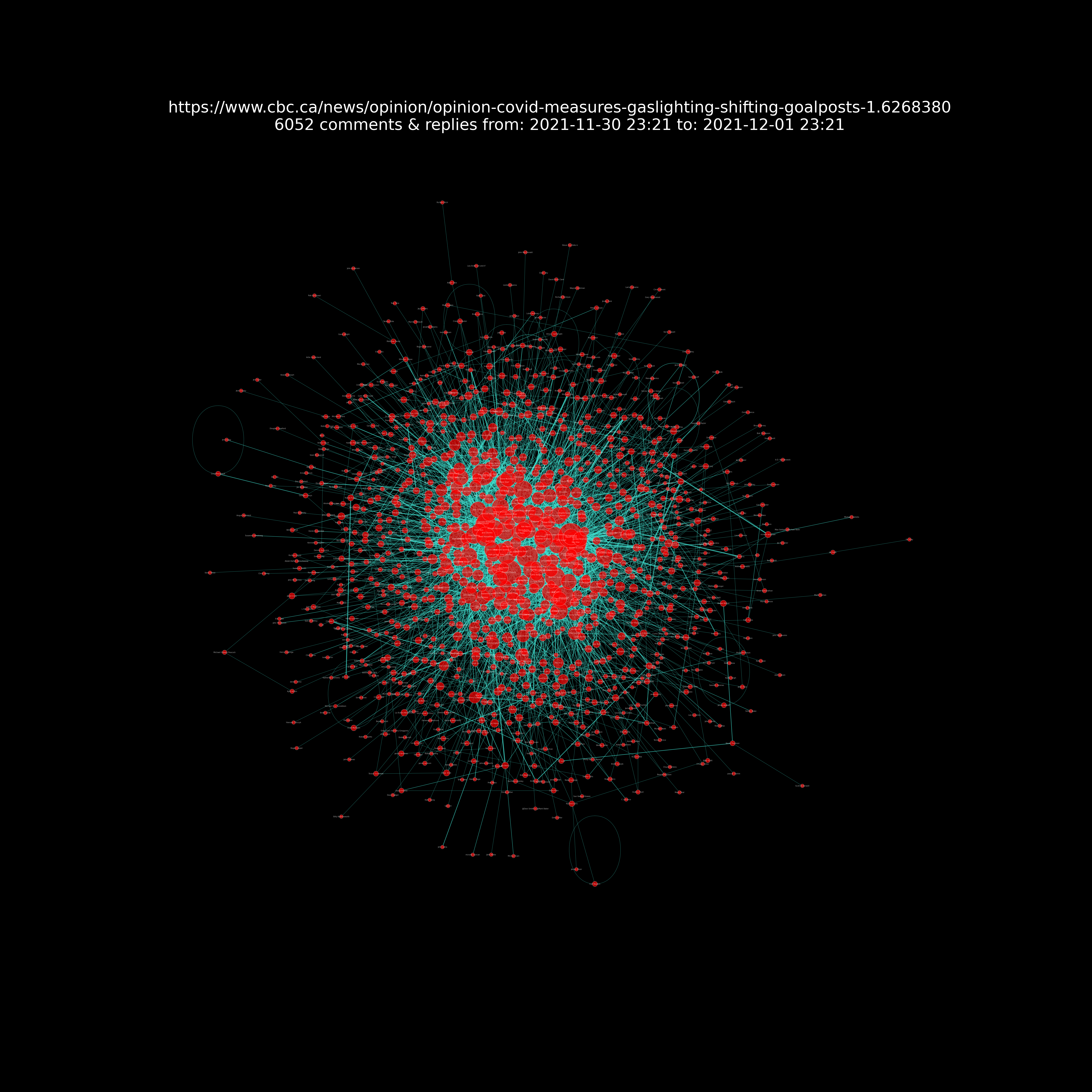
Click on the network chart image to open it in your browser or save and download the image to your desktop and zoom into it to see the detail.
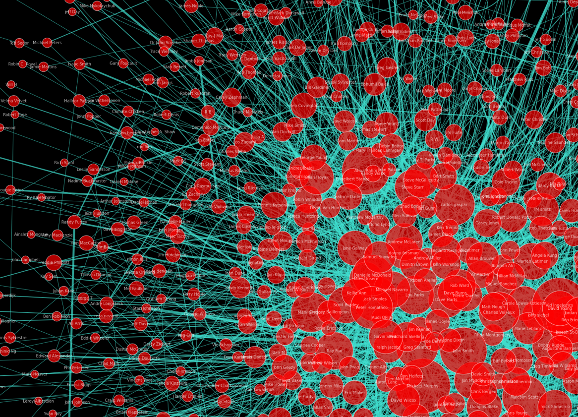
Zooming in for a closer look below shows more detail. The center of the chart has the users with the greatest number of comments and replies. The outer edges show users with fewer comments and replies.
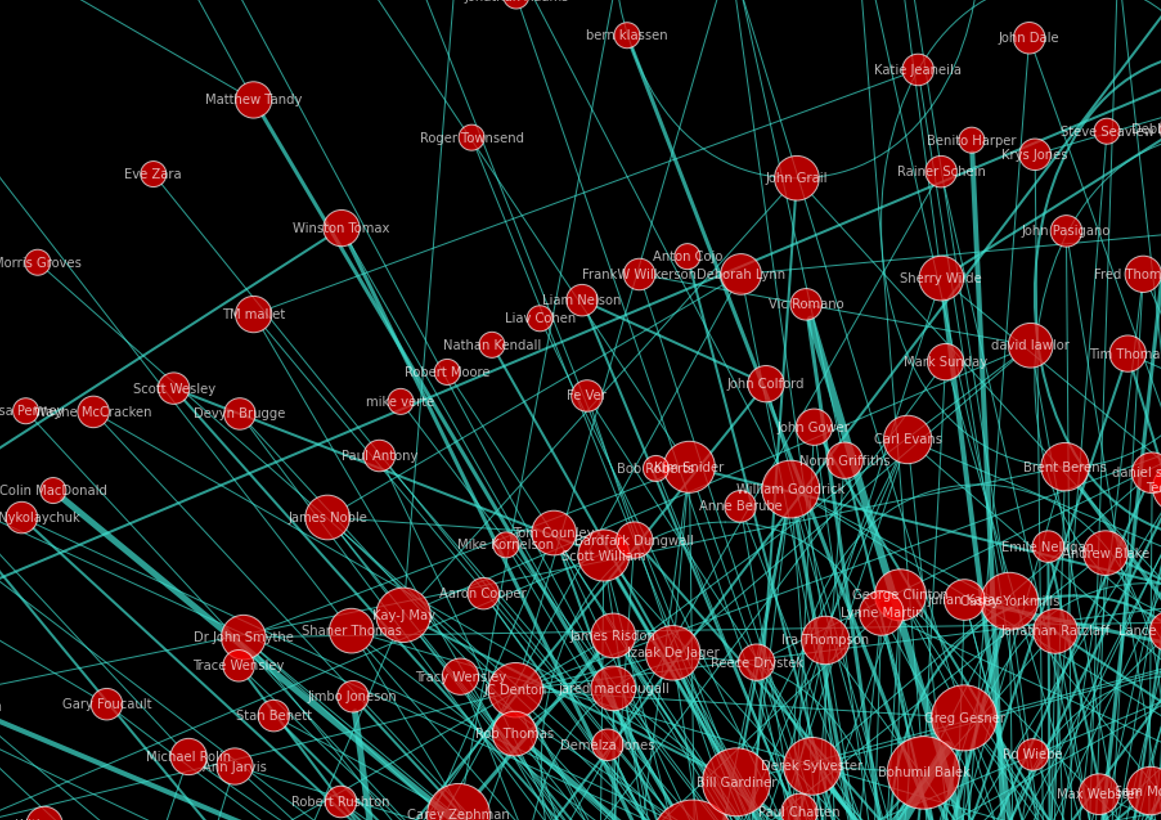
And another closer looks shows even more detail of the sparse low comment and reply count users on the edges of the chart.
A few other articles’ network charts are shown below as examples of the variations they can have.
In a fiery speech, O’Toole says Canada is ‘drowning in debt and division’ on Trudeau’s watch
Trudeau calls for global carbon tax at COP26 summit
RCMP union says it supports a Mountie’s ‘right’ to refuse vaccination

Additional analysis
Comment word frequency
In addition to the network charts, it was quite easy to make a “word cloud” visualization showing the top 200 words in all of the comments and replies.
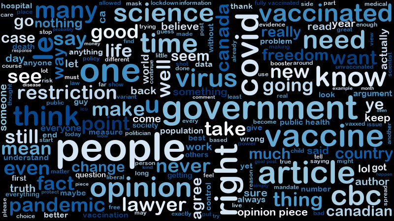
The word cloud highlights themes that arise in the comments. I think it would be interesting to do sentiment analysis on the these. Perhaps that will come in the future.
Comment people frequency
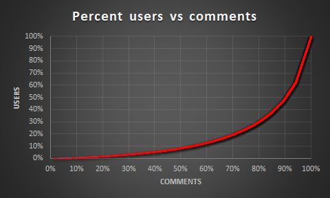
The line chart below shows percent users vs percent comments for a single article. This visualization highlights that about 50% (about 615) of 1,226 users made 90% of the comments. Only 9% (about 105 users) of the users made 50% of the comments!
The “word cloud” chart below shows the names of the top 200 users by comment and reply count. The name size corresponds to user comment and reply counts.

Of the 7,800 comments 1,744 (22%) were “top-level” comments eg they were not directly replying to another comment. The rest 6,056 (78%) were replies to another comment. This indicates a lot of interaction between comments.