TLDR: I used Amazon Transcribe to transcribe the first presidential debate audio that included timestamps for each word, to create the following speaker timeline visualization (created using a Plotly timeline chart). Click image to view full size visualization.
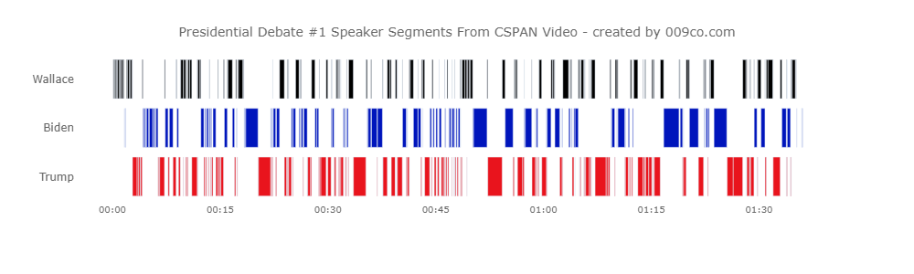
After watching the US 2020 Presidential Debate #1 I was curious to see if there was an automated way to identify when a debater was interrupted while speaking during their 2 minutes allotted time.
I envisioned a timestamped transcription that could be used to create a timeline of each speaker talking and identifying overlaps where one speaker was talking first and second speaker starts during that talk ‘segment’.
Unfortunately Amazon Transcribe purposefully shifts all of the transcribed words’ start times to eliminate overlapping word time periods. Therefore, it wasn’t possible to get the data I wanted to satisfy my curiousity using Amazon Transcribe.
It may be possible to infer overlapping speaker talking and interruptions with multiple small interleaving speaker segments but that would be hard to distinguish from two people having a conversation with the Amazon Transcribe results. Might investigate alternative automated transcription methods and make new post. TBD.
Here is link to Github repository containing code.
Getting Debate Audio
I used youtube-dl to download the debate audio from a CSPAN video recording of the debate which was on YouTube. The audio produced youtube-dl was an mp3 file. I used Libav to trim off the beginning ~30 minute portion of the audio as it was not the actual debate but pre-debate stage prep.
Using Amazon Transcribe
I used Amazon Transcribe to create a transcription of the debate audio.
Amazon Transcribe can only process audio files that are stored in an AWS S3 bucket. Uploading the file and running the Amazon Transcribe job were done using Python and AWS Boto3 SDK.
The Transcribe transcription output is a JSON file that contains “segments” for each identified speaker in the audio. These segments identify the speaker and have start and end times. Amazon Transcribe seemed to be pretty good at identifying the speakers in the audio. The transcription itself was not perfect.
The output JSON file is saved in a new S3 bucket created by Transcribe. The JSON file contains the following content and high-level structure:
-
- jobName – job name specified for transcription.
- accountId – Amazon account or IAM account?
- results– contains elements below:
- transcripts – complete text of audio transcription.
- speaker_labels – contains elements below:
- speakers – the number of speakers specified for transcription.
- segments – one or more time based segments by speaker. Has start and end time, and speaker label.
- items – segments have one or more time based items. Has start and end time, and speaker label. Does not include word.
- items – separate section with more than one item, one for each word or inferred punctuation. Includes word along with alternatives with confidence value for each word. Has start and end time, but does not have speaker label.
- status – of transcription job eg in-process, failed or completed.
Processing Transcription
The Transcribe output JSON file was read into a Pandas dataframe which was used as the data source for the Plotly timeline chart shown above.
The timeline chart data was created from the [‘results’][‘speaker_labels’][‘segment’] elements which identified the speaker and had segment start and end times. The x-axis was populated by the segment timestamps and the y-axis was populated by categorical values of speaker names.
An important data transformation was done because a Plotly timeline chart requires datetimes for period start and end and x-axis values. However the Transcribe output JSON file only has start and end times that are elapsed seconds from beginning of audio.
Therefore the elapsed seconds were transformed into “fake” dates by adding an arbitrary date (in this case “1970-01-01”) to a “HH:mm:ss” value created from the JSON file seconds values.
The Plotly timeline chart formatting was set to create nice vertical bars for each speaker segment.