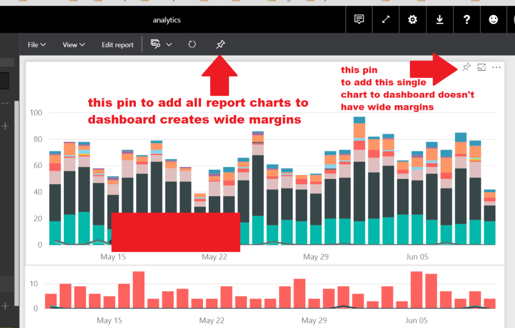
A Power BI Report with multiple charts or other objects can be added to a Dashboard in Power BI Online using the pin to dashboard feature.
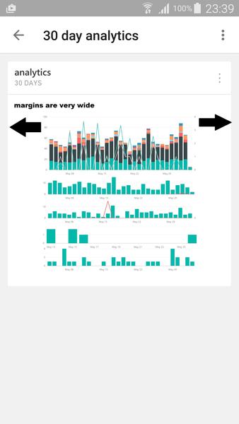
However this results in a dashboard with very wide margins. This is especially problematic on a mobile device as the screenshot from the Power BI Android application shows. There is a lot of wasted white space.
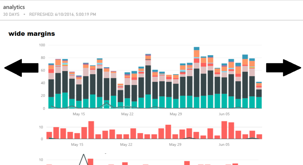
The Desktop app view is a bit better but there is still a lot of white space around the edges.
The resolution, until Power BI team make the margins smaller or add feature to change margin width, is to pin charts one by one to the dashboard in order to have them fill out width.
The screenshot below highlights where you can pin your report to the dashboard using different pins.
You can select an individual report’s pin (the one to the right) which will give you dashboard without the wide margins.
Using the pin on the top toolbar will add the entire report with the multiple reports to the dashboard and results in the wide margins seen above.